The Gentleman’s Code: How to Pair Accessories with Classic Attire
A man’s suit may speak volumes, but his accessories whisper the real story. The difference between looking merely presentable and truly polished often comes down to the subtle details—the watch that catches the light, the belt that perfectly complements your shoes, or the pocket square that adds just the right touch of personality.
In this guide, we’ll explore the art of accessory coordination for classic menswear. You’ll learn how to match your shoes, belts, metals, and fabric details to complement—not compete with—your suit, creating a cohesive look that demonstrates attention to detail and refined taste.
A Brief History of Accessory Etiquette in Menswear
The rules of men’s accessory coordination weren’t created arbitrarily—they evolved from practical origins and have been refined through generations of gentlemen’s style.
The Origins of Matching Shoes with Suits
The tradition of pairing specific shoe colors with certain suits dates back to the early 20th century when men’s wardrobes became more standardized. Black shoes were considered formal and appropriate for business and evening wear, while brown shoes were reserved for country and casual settings. This distinction emerged from British aristocratic dress codes, where black was the color of formality in London, while brown was acceptable only in the countryside.
Why Belts and Shoes Were Once Military Regulated
The practice of matching your belt to your shoes has military roots. Military uniforms required precise coordination of leather goods—belt, shoes, and holsters all needed to match exactly. This uniformity created a sense of order and attention to detail that eventually transferred to civilian dress codes. The military’s influence on men’s fashion extended beyond matching leathers to include the importance of proper fit and polished presentation.
The Evolution of Tie and Pocket Square Conventions
The pocket square and tie relationship has undergone significant changes. In the early 20th century, matching your tie and pocket square exactly was considered proper. By mid-century, style authorities began advocating for complementary rather than identical pairings. Today’s rule—that pocket squares should complement but never exactly match your tie—reflects a more sophisticated understanding of color theory and visual interest in an outfit.
The Rules of Color Matching
Mastering color coordination is perhaps the most fundamental aspect of accessory pairing. The right combinations create harmony, while mismatches can undermine an otherwise excellent outfit.
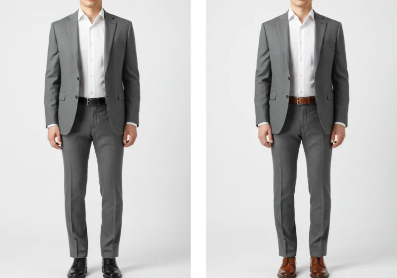
Which Shoe Colors Go with Which Suits
Different suit colors call for specific shoe pairings:
-
Navy Suit: The most versatile option, pairs beautifully with black shoes (most formal), brown shoes (business appropriate), or burgundy/oxblood (stylish with personality).
-
Grey/Charcoal Suit: Medium to light grey suits work with black, brown, or oxblood shoes. For charcoal suits, stick to black or deep oxblood and avoid medium brown, which can create an awkward contrast.
-
Brown/Tan Suit: Always pair with brown or burgundy shoes that are darker than the suit itself. Avoid black shoes with brown suits—this combination creates a jarring visual disconnect.
-
Black Suit: Only wear with black shoes. This is the one rule with virtually no exceptions in traditional menswear.
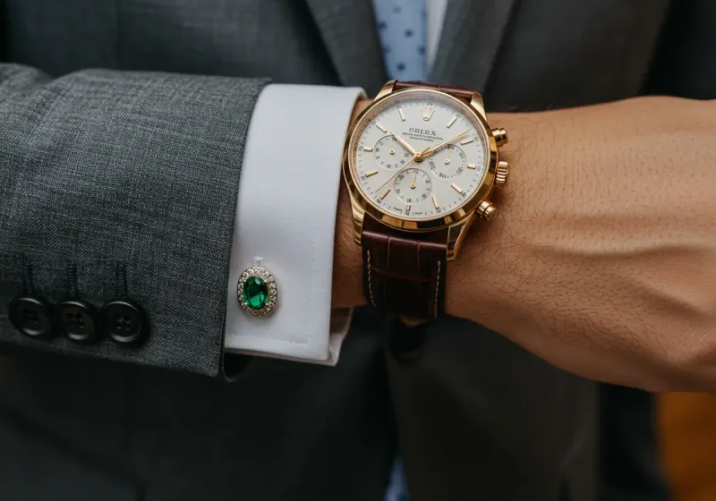
How Metal Tones Affect Formality and Harmony
The metals in your accessories—watch, cufflinks, belt buckle, tie bar—should all match in tone:
-
Silver/Platinum/White Gold: Creates a cooler, more modern look that pairs well with cool-toned suits (navy, grey, charcoal).
-
Yellow Gold/Brass: Offers warmth and pairs beautifully with earth tones and navy. Gold tends to read as slightly more formal or traditional.
-
Rose Gold/Copper: A contemporary option that adds warmth while feeling modern. Works well with navy and grey suits.
Mixing metals sends a message of carelessness rather than intentional style, so choose one metal family and stick with it throughout your accessories.
When to Use Contrast vs. Tonal Pairings
-
Tonal Pairing: Keeping accessories in the same color family as your suit creates a sophisticated, streamlined look. Example: Navy suit with navy tie and navy-based pocket square.
-
Contrast Pairing: Using complementary or contrasting colors creates visual interest and personality. Example: Navy suit with burgundy shoes and a burgundy-accented pocket square.
For formal settings, subtle tonal pairings are generally more appropriate. For creative environments or social occasions, thoughtful contrast shows confidence and style awareness.
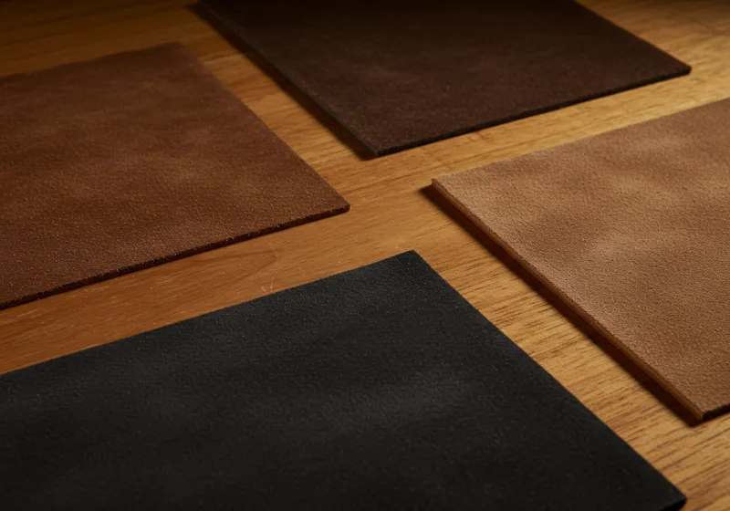
The Importance of Material and Finish
Beyond color, the texture and finish of your accessories create cohesion and demonstrate attention to detail.
Glossy vs. Matte Leather — When It Matters
The finish of your leather accessories should align with the formality of your outfit:
-
High-gloss/Patent Leather: Reserved for formal evening wear, black-tie events, and the most formal business settings.
-
Polished Calfskin: The standard for business wear—refined without being overly formal.
-
Matte Finishes: More casual and contemporary, appropriate for creative workplaces and social settings.
The rule is simple: match the formality level of your leather’s finish to the formality of your outfit. A highly polished oxford deserves a belt with similar refinement, while a casual suede desert boot pairs better with a matte, casual belt.
Matching Strap Texture to Shoe Texture
Consistency in leather texture creates visual harmony:
- If you’re wearing smooth calfskin shoes, your belt should be smooth calfskin.
- If you’ve chosen suede shoes, a suede or nubuck belt maintains the theme.
- Pebble-grain or textured leather shoes pair best with similarly textured belts.
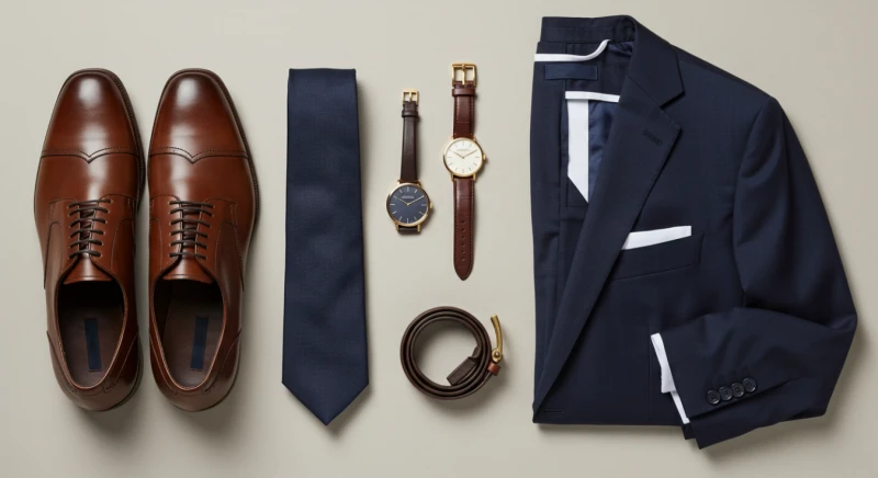
This principle extends to watch straps as well—a leather watch strap should match your shoes and belt in both color and texture whenever possible.
Watch Bands, Wallets, and Subtle Texture Coordination
The subtlest form of accessory coordination involves matching the small leather goods you carry:
- Your watch strap should ideally match your shoes and belt.
- A leather wallet visible when paying the bill is most elegant when it coordinates with your other leather accessories.
- Even items like eyeglass frames can be chosen to complement your metal accessories.
These details might seem minor, but they’re often what separate the truly well-dressed from those who are merely wearing nice clothes.
Accessory Coordination Beyond Shoes
While shoes form the foundation of accessory coordination, other elements deserve equal attention.
Belts — Width, Texture, Buckle Metal
The perfect belt follows three matching principles:
- Color: Should match your shoes as closely as possible.
- Texture: Should mirror the finish of your shoes (glossy with glossy, matte with matte).
- Buckle: Metal should match your watch case, cufflinks, and other metal accessories.
Belt width matters too—dress belts should be relatively narrow (1.25-1.5 inches) with a simple buckle, while casual belts can be slightly wider with more decorative buckles.
Watches — Face Size, Strap Type, Matching the Suit’s Vibe
Your watch should complement both the formality and aesthetic of your outfit:
- Formal attire: Thin, elegant dress watches on leather straps.
- Business wear: Mid-size watches with leather straps or refined metal bracelets.
- Business casual: More substantial watches, potentially with complications.
- Casual wear: Sportier watches, chronographs, or contemporary designs.
The size of your watch should also correspond to the occasion—oversized watches rarely work with formal attire, while very small dress watches can look out of place with casual clothing.
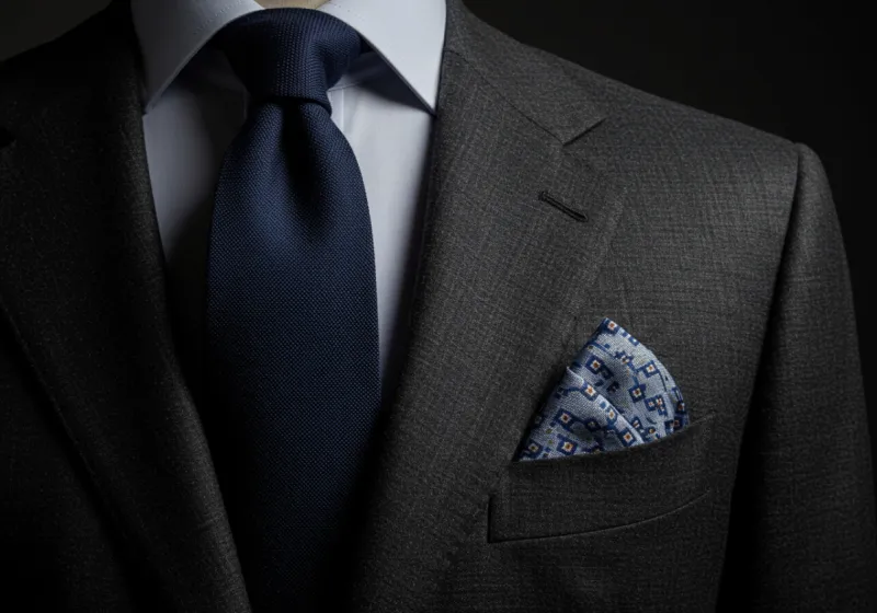
Pocket Squares & Ties — How to Complement, Not Clone
The relationship between your tie and pocket square is one of the most visible aspects of accessory coordination:
- They should complement each other without matching exactly.
- Pick a secondary color from your tie to feature in your pocket square.
- If your tie has a pattern, your pocket square can be solid (or vice versa).
- White pocket squares are always appropriate and create a clean, classic look.
The fold of your pocket square also matters—TV folds (straight across) for business, puff folds for social occasions, and more elaborate folds for festive events.
Common Mistakes and How to Avoid Them
Even well-dressed men occasionally fall victim to these common accessory coordination errors.
Mismatched Metals
One of the most noticeable mistakes is mixing metal tones in visible accessories. A gold watch with silver cufflinks and a belt buckle in yet another finish creates visual discord. Choose one metal family (silver/platinum, gold/brass, or rose gold/copper) and ensure all visible metals match.
Over-Matching
While coordination is important, exact matching of patterns and colors across accessories looks contrived. The classic example is the matching tie and pocket square set—a shortcut that signals a lack of sophistication. Instead, your accessories should relate to each other through complementary colors or patterns, not identical ones.
Wearing Casual Shoe Textures with Formal Suiting
Context-appropriate textures matter tremendously. Suede shoes, while elegant in their own right, are too casual for formal business suits or evening wear. Similarly, highly textured or pebble-grain leathers belong in more casual settings. Match the refinement level of your shoe’s texture to the formality of your outfit.
When to Break the Rules (and How to Do It Well)
Style rules exist to guide, not restrict. Understanding when and how to thoughtfully bend these guidelines demonstrates true mastery.
Using Contrast with Intention
Deliberate rule-breaking can create striking, memorable looks:
- A navy suit with unexpected deep green shoes creates a sophisticated statement.
- A vintage watch that doesn’t match your other metals can serve as a conversation piece.
- A boldly patterned tie with a complementary (not matching) pocket square shows confidence.
The key is intentionality—breaking rules knowingly rather than accidentally.
Modern Accessory Swaps
Contemporary style allows for thoughtful updates to traditional pairings:
- Clean, minimal white sneakers with a suit can look modern and appropriate in creative settings.
- Knit ties instead of silk add texture and casual flair to business attire.
- Fabric watch straps (like NATO straps) offer a way to introduce color and personality.
These modern interpretations work best when the rest of your outfit follows traditional guidelines—balance is essential.
Situational Dressing: Date Night vs. Boardroom vs. Wedding
Context should always inform your accessory choices:
- Boardroom: Conservative, traditional pairings with minimal rule-bending.
- Wedding: Opportunity for personality through pocket squares, boutonnieres, and tasteful color.
- Date Night: More expressive choices that reflect your personal style and interests.
Understanding the expectations of each setting allows you to express personality while remaining appropriate.

Build Your Style with Intention
Accessories are the finishing touches that transform an outfit from good to unforgettable. They tell the story of your attention to detail, your understanding of tradition, and your confidence in personal expression.
As you develop your personal style, consider building a foundation of quality accessories that work together harmoniously:
- A collection of well-made shoes in versatile colors
- Belts that precisely match those shoes
- A selection of ties and pocket squares that complement your suits
- Watches and small leather goods that reinforce your overall aesthetic
Remember that accessory coordination isn’t about rigid rules but about creating visual harmony. The most stylish men understand the guidelines well enough to follow them faithfully when appropriate—and break them intentionally when the situation calls for personal expression.
Take time to audit your accessory collection, ensuring each piece works within your wardrobe system. With thoughtful coordination, your accessories will elevate every outfit, communicating refinement and attention to detail without saying a word.